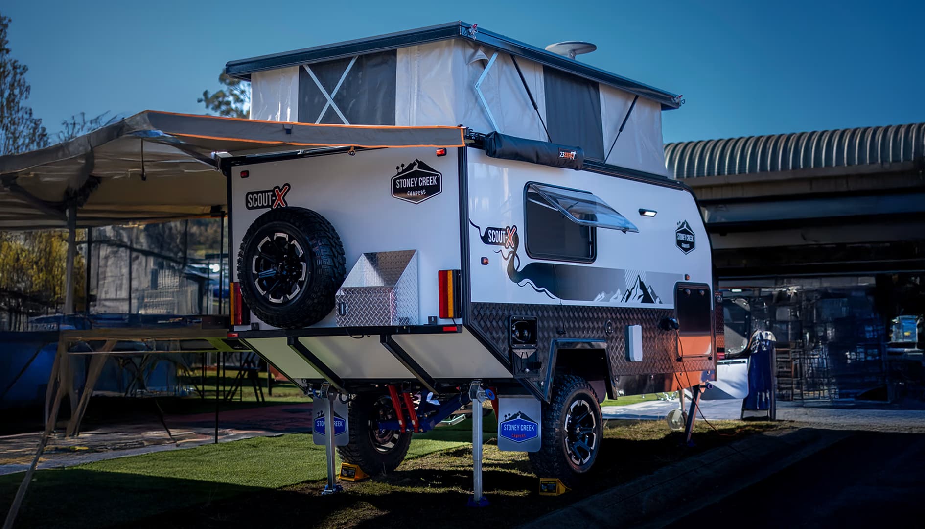
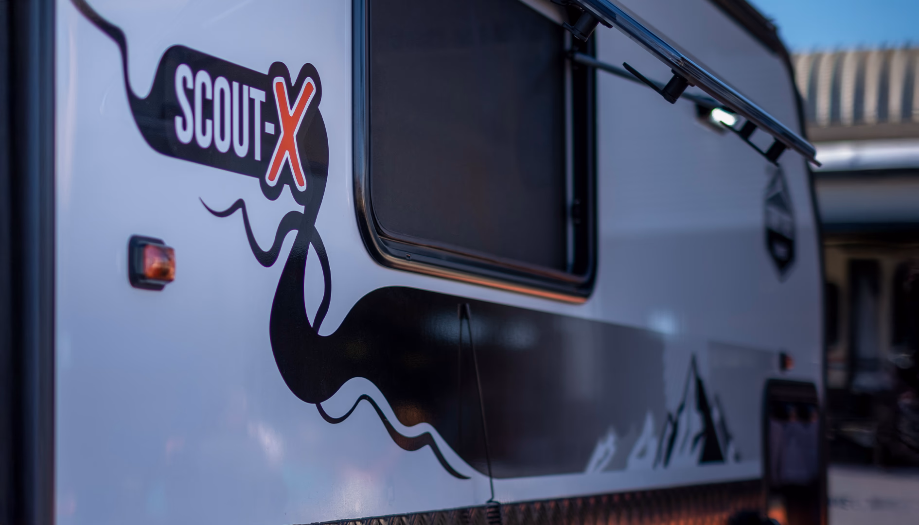
Custom decal wrap design for Stoney Creek Campers' Scout X product line. A comprehensive visual identity that sets the Scout X apart through distinctive graphics, typography, and color treatment that speaks to adventure seekers.
The Challenge
The camper trailer market is crowded. Every manufacturer promises adventure and freedom. Stoney Creek needed their new Scout X line to stand out immediately, not blend into the sea of similar-looking trailers at dealerships. The challenge was creating a distinctive visual identity that could be applied to camper exteriors. Something bold enough to catch attention from across a showroom floor, cohesive enough to work across the entire Scout X product range, and authentic to what Stoney Creek stands for.
The Solution
We designed a comprehensive decal wrap system for the Scout X camper line. Custom graphics combine rugged patterns with clean geometry. They're bold without being loud. The color palette uses earthy tones that feel authentic to outdoor adventure. Deep forest greens, weathered browns, and strategic pops of accent color that catch the eye.
Typography treatment adds character without sacrificing readability. The Scout X wordmark sits prominent but balanced. Logo placement works across different camper sizes and configurations.
Every element works together. The graphics flow around camper contours. The colors create visual interest from every angle. The result is a product line that looks distinctive on dealer lots and out in the wild. Scout X campers are immediately recognizable as part of the Stoney Creek family, but they have their own strong identity within it.
The Design Approach
The Scout X decal system needed to work as a family. Different camper sizes mean different surface areas, different proportions, different challenges. The graphics system we created is modular. Core elements stay consistent, but the layout adapts to each model.
Designing for camper exteriors has constraints you don't face with flat graphics. Curves, vents, windows, doors. Every camper has features that interrupt clean lines. We designed the pattern to flow around these obstacles naturally. The graphics enhance the camper's form instead of fighting against it.
The color palette does heavy lifting. It connects Scout X visually to the broader Stoney Creek brand while giving the line its own personality. The typography anchors everything. Bold enough to read from a distance, refined enough to not feel cheap.
It's product design and brand design working together. The decal wrap doesn't just sit on the camper. It becomes part of what makes a Scout X feel like a Scout X.
Kind Words
“Love Sasha's graphic design work! Prompt responses and nailed the brief to a T!”