SPARK Ipswich
Multi-event festival brand built to last
SPARK Ipswich runs for 11 days every winter. Fifty-plus events, each with its own sub-brand. Music, comedy, light installations, kids' festivals. We created a core brand that works with all of them.
The Challenge
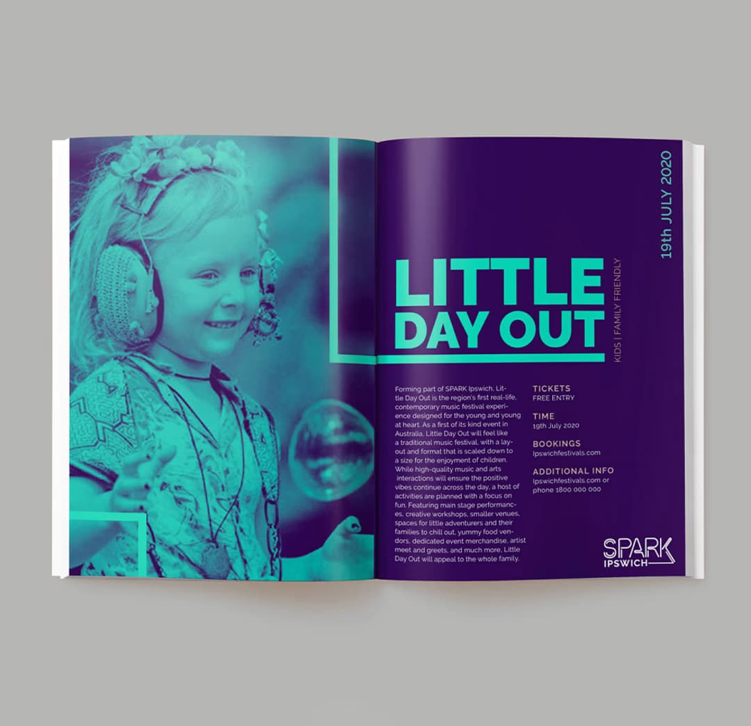
SPARK Ipswich needed a core festival brand that could flex across fifty different events. Each event has its own identity. Little Day Out for kids. WOMI for music. deLight and Pixel for projections. The core brand had to be strong enough to unify them all without crushing their individual personalities.
The festival runs every winter. Same brand, different events each year. It needed to be timeless, not trendy. Something Ipswich City Council could reuse for years without looking dated.
The Solution
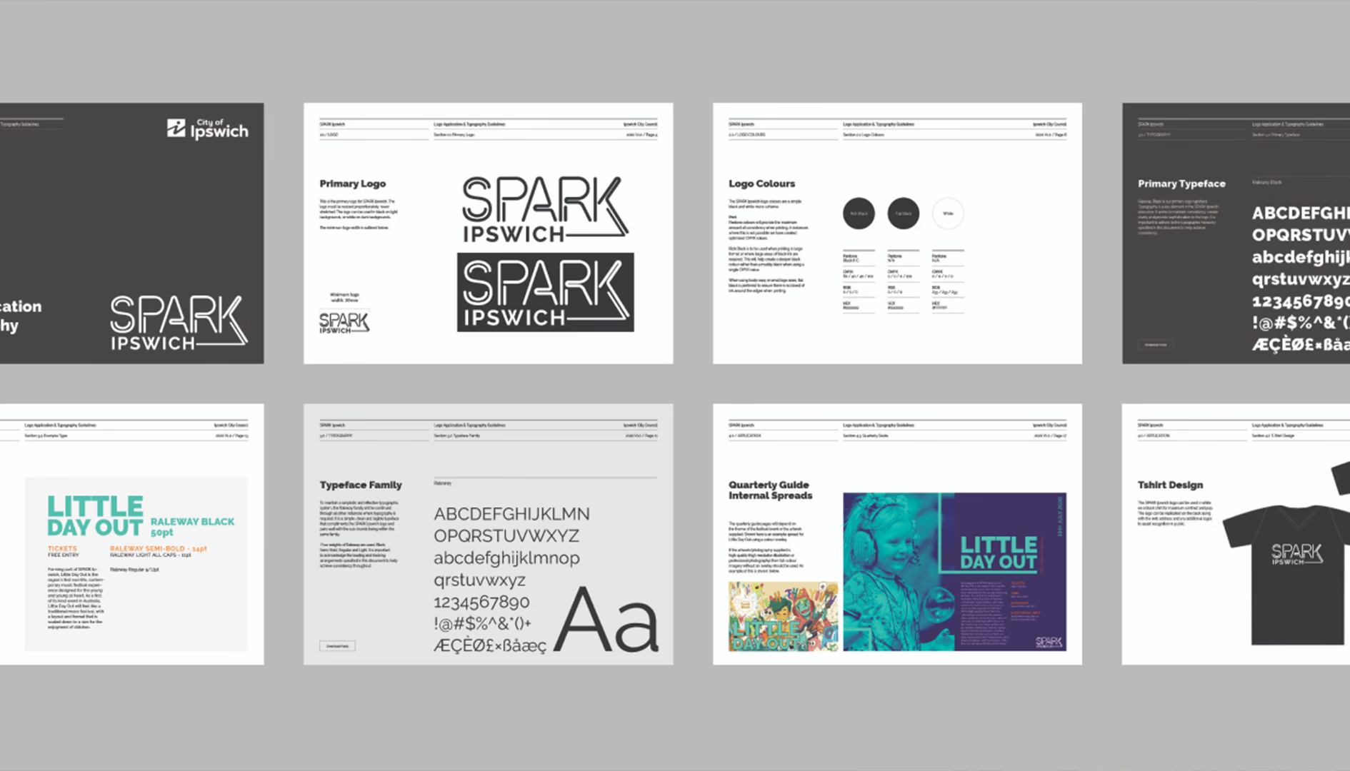
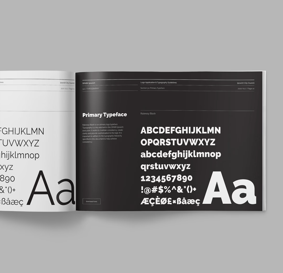
We built the brand on strong typography. Clean. Bold. Unmistakably SPARK. The mono-black palette was deliberate. When you're working with fifty sub-brands, each with their own colors and visual language, the core brand needs to get out of the way while still being present.
The typographic system is the hero. Big, confident type that owns the space. It works on billboards. On posters. On Instagram squares. It doesn't compete with sub-brand colors or imagery. It frames them.
The result is a brand that's been in use for multiple festival cycles. Same core identity, different events each year. It hasn't needed a refresh because it was designed not to.
The System
How we built a brand flexible enough for fifty events but strong enough to last years.
Typography as the Foundation
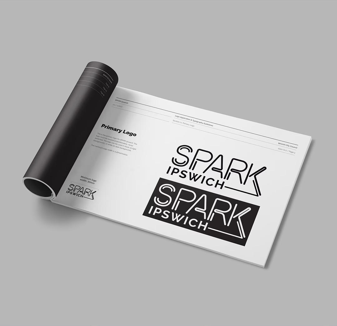
Strong type was the answer. The SPARK wordmark is bold enough to stand alone on a billboard or work as a lockup with sub-brand elements. We developed a type system that creates hierarchy without relying on color.
Different weights for different applications. The heaviest weight for festival-level materials. Lighter weights for event details and supporting information. The system creates visual order across dozens of events without needing a complex rulebook.
Mono-Black Flexibility
Fifty events means fifty color palettes. Some sub-brands use neon. Some use pastels. Some use photography. The core SPARK brand needed to work with all of them.
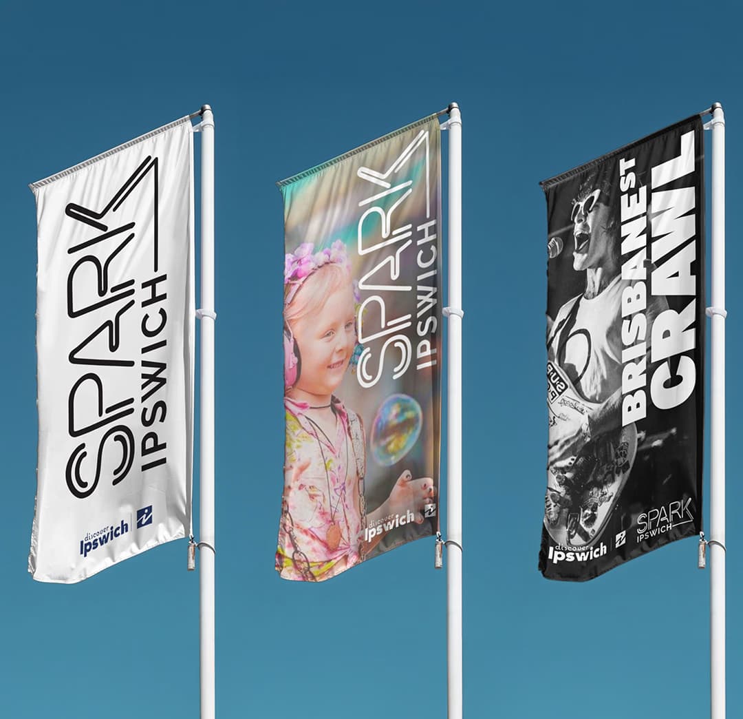
Black and white provided that flexibility. The brand sits on top of or alongside sub-brand visuals without clashing. Event organizers can use their own colors and imagery. SPARK provides the structure.
Built for Reuse
This wasn't a one-year project. The brand needed to work for multiple festival cycles. We designed for longevity, not trends.
The type system is timeless. The mono-black palette won't date. Event imagery and sub-brands change each year, but the core SPARK identity stays consistent. Several years in, it still works.

